Understanding the Importance of Mobile-First Design
Take a look around you—how many people are glued to their phones? Odds are, it’s nearly everyone. In today’s hyper-connected world, mobile-first design isn’t just a trend; it’s the heartbeat of how we consume digital content. If your platform doesn’t cater to the fingertips of mobile users, you’re waving goodbye to a massive slice of your audience.
Why Users Judge With Just a Swipe
First impressions happen fast on mobile. A cluttered screen? Slow load times? Say goodbye to that potential reader or subscriber. Users crave seamlessness—content that’s not only gorgeous but instantly accessible on their devices. Mobile-first design is like rolling out the red carpet for them, giving their thumbs an intuitive, frustration-free experience.
- Speed reigns supreme: A delay as small as three seconds can hike your bounce rate by over 30%.
- Simplicity wins hearts: Clunky navigation or overwhelming visuals? That’s so last decade.
- One-handed usability: Is your platform friendly for multitaskers sipping coffee while scrolling?
The Emotional Connection Behind Mobile-First
Think about it: mobile is where readers laugh at memes, shop for gifts, and binge-read articles in bed. By embracing mobile-first strategies, you’re meeting them in their favorite digital hangout. It’s not just about sizing things down; it’s about delivering an experience that feels personal, like a conversation instead of a lecture.
Key Principles of Mobile-First Strategies
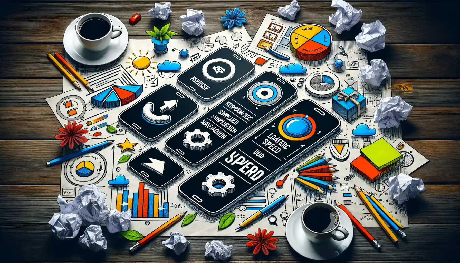
Designing for Touch, Not Click
Building a mobile-first strategy is like preparing for a bustling street market—you need to anticipate the fast pace, tight spaces, and quick decisions. First and foremost, think about how users interact. On mobile, it’s not a mouse click; it’s fingers, thumbs, and sometimes the occasional knuckle swipe. Big, bold buttons that are thumb-friendly? Essential. Squint-inducing links or cramped layouts? Absolutely not!
Mobile users are multitaskers—they’re checking your platform while waiting for coffee, walking their dog, or even mid-conversation (we see you!). Navigation should be as simple and instinctive as grabbing a cup of coffee.
- Use clear, logical menus that guide rather than overwhelm.
- Minimize distractions—pop-ups can feel like roadblocks on a small screen.
Streamline Every Single Pixel
Here’s a hard truth: people on their phones won’t stick around for clutter. Every pixel must pull its weight. Think of a digital magazine layout—on desktop, it might look like an art gallery. On mobile, it should feel like flipping through a sleek, elegant journal.
Craft your content and visuals in layers: start small, then scale up. For example, prioritize headlines and key images; bury secondary elements deeper in the scroll. Always ask, “What’s the absolute *must-see* experience here?” Let that guide your decisions.
Integrating Responsive Design and User Experience

Why User Experience is Your Secret Weapon
Imagine stepping into a café where everything is designed just for you—the lighting, the aroma, even the chair height. That’s what an exceptional user experience (UX) feels like when paired with responsive design. It’s not just about making your digital platform look good on every screen size; it’s about *feeling* good to use.
At its core, integrating responsive design and UX means treating your users as humans, not just clicks or stats. Think about how frustrating it is when you pinch-zoom a page, and text still looks like hieroglyphics on a cave wall. Let’s avoid that tragedy together, shall we?
Here’s your golden rule: a seamless experience isn’t magic—it’s strategy. From touch-friendly buttons to easily scannable content, every small detail brings joy to your users.
- Optimize for fast loading times—even nanoseconds matter.
- Ensure navigation—menus, links, and CTAs—is intuitive and thumb-friendly.
- Design for flexibility: does your layout adapt automatically on a tablet, phone, or even a smartwatch?
Responsive design without UX is like a beautiful car with no steering wheel. Don’t just look polished—drive people somewhere they’ll want to be!
Crafting Emotional Connections Through Design
Here’s something people don’t tell you enough: great UX doesn’t stop at functionality. It sparks emotion. A warm, minimalist design can feel like curling up with a favorite book, while dynamic, bold visuals can ignite excitement like starting a new adventure.
Consider content hierarchy. Is your audience greeted by key headlines at first glance, or are they lost in a maze of clutter? For example, a digital publishing platform might highlight breaking news links up top while tucking away evergreen stories below. This thoughtful structuring whispers, “We know what matters to you.”
Another example: interactive elements. When done right—like sliders or micro-animations—they don’t just add spice but build a relationship. Engaging design choices create moments that leave a lasting impression.
Your goal? Make your readers, whether bingeing articles or browsing sporadically, feel like the platform was crafted with them in mind. Because in the end, isn’t that what everyone wants?
Optimizing Content for Mobile Consumption

Crafting Bite-Sized Brilliance
Picture this: your content is a juicy apple, but mobile users only have time for a quick, satisfying bite. To truly thrive on handheld screens, every piece of your content should feel like it’s been designed with their busy lives in mind. Mobile readers aren’t scrolling lazily; they’re snacking on-the-go. Small attention spans? Yep, that’s your challenge—and also your golden opportunity.
Turn dense paragraphs into digestible nuggets that pack a punch. Use short sentences, straightforward language, and **punchy words** that cut through the noise. Break up the monotony with subheadings, white space, and visuals. And don’t forget the power of lists!
- Use bullet points to deliver key takeaways faster than a swipe.
- Make headlines irresistible—promise value upfront.
The Magic of Scannable Content
Here’s the thing about mobile consumption: it’s all about scanning, not reading. Think *bold, eye-catching*, and instant clarity. Use larger fonts for titles and ensure body copy adjusts effortlessly to any screen size. Play with formatting—bold phrases, italics, and calls-to-action to keep their gaze locked.
Also, remember visuals rule the roost. A well-placed image can say more than a paragraph ever could. Ensure your graphics are lightweight but sharp, loading fast without compromising quality. Nobody waits for a slow-loading page! Optimize those precious seconds, because on mobile—they’re everything.
Future Trends in Mobile-First Digital Publishing

The Rise of AI and Personalization in Mobile Publishing
The future of mobile-first digital publishing feels a lot like stepping into a sci-fi dream—where everything is tailored just for you, and technology predicts your needs before you even realize them. One of the most groundbreaking shifts is the integration of AI-driven personalization. Imagine opening your favorite reading app and finding not only content that speaks to your unique interests but also dynamically adjusting layouts that cater to your screen size, reading habits, and even the time of day.
Here’s what’s already exciting publishers and readers alike:
- Predictive content recommendations: AI isn’t just suggesting articles anymore—it’s curating an entire experience based on your preferences.
- Interactive storytelling: Think quizzes, live feeds, and chat-like narratives seamlessly adapted to mobile formats.
- Localized content delivery: From language choices to region-specific news, mobile publishing is becoming hyper-relevant.
5G and the Explosion of Multimedia Content
As 5G becomes universally accessible, the doors are flinging wide open for immersive mobile experiences. Forget waiting for videos to load or podcasts to buffer. Tomorrow’s mobile-first world will thrive on instantaneous multimedia streaming. Picture scrolling through an article where embedded videos play smoothly, interactive infographics draw you in, and augmented reality (AR) elements enhance your understanding.
This shift also means a growing demand for publishers to rethink their strategies. Static isn’t going to cut it. Instead, they’ll lean heavily on fast, feature-rich assets like short-form explainers, animations, and even gamified content—all delivered with lightning speed. In a mobile landscape driven by constant innovation, the possibilities feel endless.